One of the keys to a successful business in 2016 is a strong website — this isn’t any sort of revelation but this simple fact is too often still overlooked. Last week, Detroit-area Body-Solid dealer, Exercise Warehouse, launched a redesigned website that has many notable features that we love. Here are a few of our favorites.
Homepage
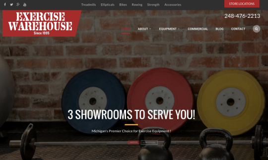
Exercise Warehouse’s homepage is clear, informational and best of all, beautiful to look at. You’ll notice at the top of the page they have a section for their social media links (yet another key to successful business in 2016) as well as navigation to their different product categories, a store locations tab and nicely tucked in, their phone number. We’re particularly fond of the inclusion of the phone number which allows people who jump to the site the opportunity to call the company directly if they don’t want to browse around or search for what they are looking for. We all know some customers prefer the human approach to purchasing and this is a great asset to achieve that.
You’ll also notice from this home page, the big, bold photo in the background. This is an immediate attention grabber and allows Exercise Warehouse to showcase any sales, exclusive offers or featured products easily and effectively.
Who We Are (Homepage)
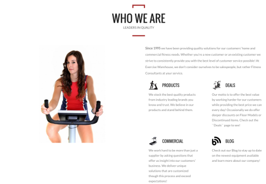
Just below the initial homepage screenshot we shared is an informative “Who We Are” section which is highly recommended for any dealer website. This allows visitors to your site to know you aren’t a fly-by-night operation but a real company ran by real people with a brand and mission statement. This section allows Exercise Warehouse to let visitors know not only do they provide home and commercial fitness, but have been in business since 1995, adding increased brand trust.
Category Pages
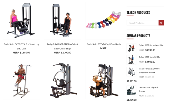
Exercise Warehouse’s category pages are very clean but again, super informational. Your eyes are immediately drawn to the photos which sit nicely on the white background. They are big enough where you can get an idea of the product in question and its various features but small enough where you can browse multiple items at once easily. We also love how clearly the MSRP is displayed making the browsing experience easy. The “Similar Products” column on the left is also a good idea as customers often look at multiple items before finally making their purchase. Giving them an easy way to check out those various options is a great idea.
Product Page
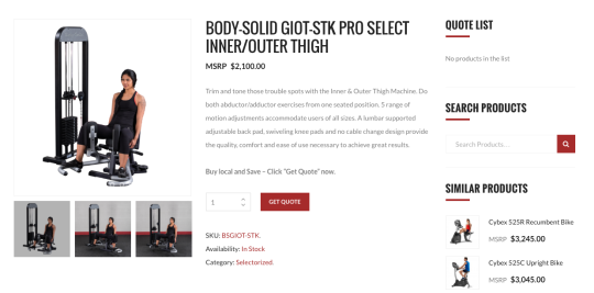
Similar to the category pages, Exercise Warehouse’s product pages are clean, concise but don’t slouch on information. Photos are easily found, as well as a product description and a very clear way to get a quote.
Another great tip if you choose to redesign your site in the near future: look outside of the competition. See what other e-commerce websites outside of the fitness realm are doing, find out things you like or dislike about other sites. This will help you not only stand out from the competition but learn what customers are attracted to on a website.
We hope that you can take some of what Exercise Warehouse did with their website and integrate it into your next redesign!